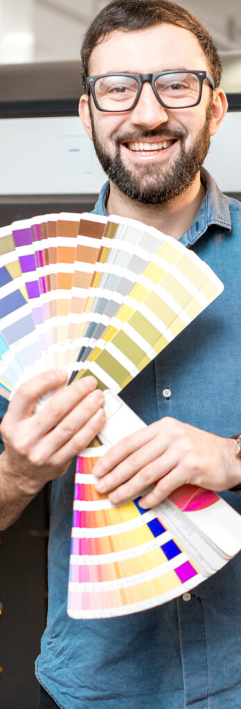
Colors are a powerful tool that can be used to create a variety of effects in property tours. By understanding the basics of color theory, content creators can use color to enhance their storytelling and create a more visually appealing experience for their audience.
Lets discuss some of the ways that colors are used
To set the tone of a scene—. For example, a scene that is meant to be suspenseful might be shot in dark, muted colors. A scene that is meant to be romantic might be shot in bright, saturated colors. Good for real estate content.
To create a sense of mood—. For example, a scene that is meant to be sad might be shot in shades of blue and gray. A scene that is meant to be happy might be shot in shades of yellow and orange. Good for luxury gurgaon flat tours videos.
To represent characters or themes—. For example, a character who is meant to be evil might always be dressed in black. A character who is meant to be innocent might always be dressed in white. Host in real estate videos can wear costume in style.
To create visual symbolism.— For example, a red rose might represent love, while a black crow might represent death.
Lets discuss some of the color rules that are commonly used in cinematography:
The 60-30-10 rule—. This rule states that the dominant color should be present in 60% of the frame, a secondary complementary color should be present in 30% of the frame and the remaining 10% should be an accent color. This simple formula provides a balanced color palette with a bit of visual contrast.
The color wheel.— The color wheel is a helpful tool for understanding how colors interact with each other. The colors on the wheel can be divided into three categories: primary colors, secondary colors, and tertiary colors. Primary colors are red, yellow, and blue. Secondary colors are created by mixing two primary colors together. Tertiary colors are created by mixing a primary color with a secondary color.
Complementary colors—. Complementary colors are colors that are opposite each other on the color wheel. When complementary colors are placed next to each other, they create a strong contrast. This can be used to create a sense of excitement or energy in a scene.
Analogous colors—. Analogous colors are colors that are next to each other on the color wheel. Analogous colors create a sense of harmony and unity. This can be used to create a calm or relaxing atmosphere in a scene.
Triadic colors—. Triadic colors are three colors that are evenly spaced around the color wheel. Triadic colors create a sense of balance and symmetry. This can be used to create a sense of order or stability in a scene.
The use of colors in cinematography is a complex subject. There are many different ways that colors can be used to create a variety of effects. By understanding the basics of color theory, filmmakers can use color to enhance their storytelling and create a more visually appealing experience for their audience.
We are the best video production agency for real estate video content. Call now
7042111335
info@cutsncamera.in
